Newsletter Website – Politics
An exceptionally user-friendly website designed with a focus on reading comfort and seamless navigation. Crafted with passion and meticulous attention to detail, this pixel-perfect project is highly structured, flawlessly executed, and built to impress.
Client
Nerativ
Service
Analysis, Web Design, Web Development
Date
June 2025
Project Overview
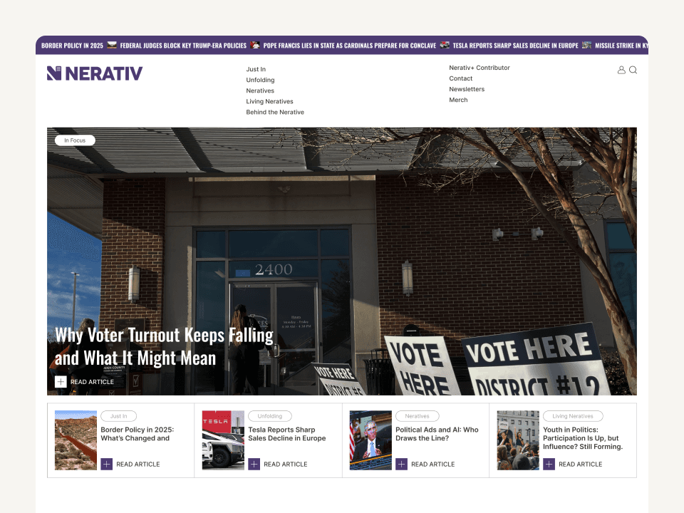
This project involved creating a completely new political news and newsletter platform tailored to the U.S. market. With an oversaturated digital media space dominated by similar branding and site structures, the challenge was to introduce a distinct voice and visual identity that feels trustworthy, fresh, and comfortable for readers.
The first phase centered on comprehensive industry research and competitor analysis. We examined major political newsletters and online publications across the U.S. to identify common patterns and gaps. From this, we saw a strong need for differentiation — visually and functionally.
We deliberately chose purple as the brand’s primary color — a symbolic blend of red and blue that suggests neutrality, balance, and independent thinking, aligning with the platform’s editorial vision.
⸻
Design Process
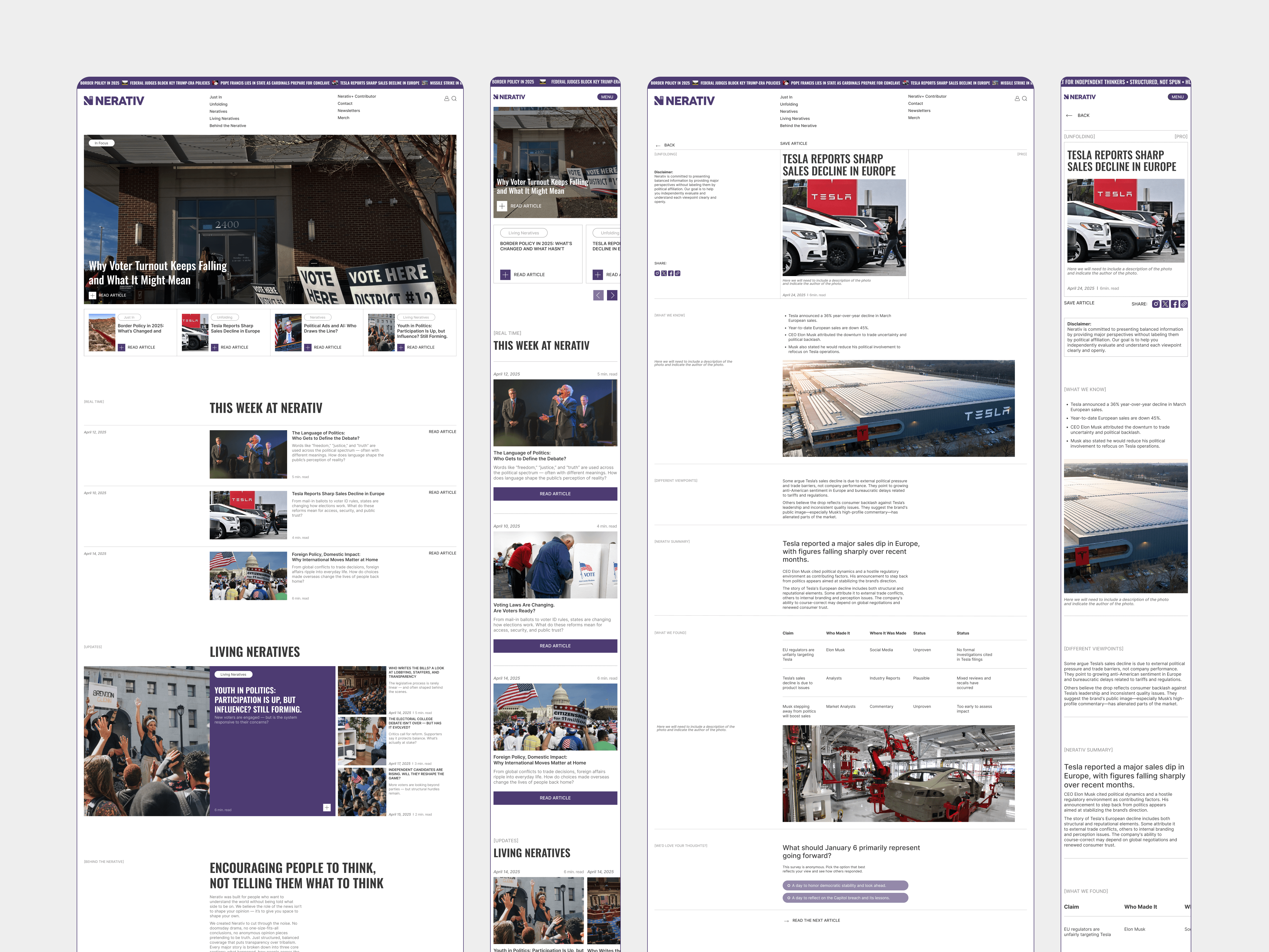
Our goal was to make reading long-form content intuitive and enjoyable. Every layout decision, font choice, spacing rule, and visual element was guided by the principle of reader comfort. We aimed for a clean, distraction-free structure to highlight thoughtful journalism.
In terms of site architecture, the platform needed to accommodate different subscription levels and interactive features. We created a structure that supports:
Unsubscribed Visitors: Access to limited article content.
Free Subscribers: Access to expanded sections including curated highlights and opinion contrasts.
Paid Subscribers: Full access to in-depth analysis, polls, interactive data, and member-only content.
In addition, we built tools for polls and fact-based summaries to encourage reader interaction and deeper engagement.
The design phase included:
Wireframing key user flows and content structures
Designing desktop and mobile layouts for maximum readability
Creating scalable UI components and a flexible design system
This approach helped ensure a smooth transition into the development phase, laying a solid foundation for a high-performing editorial platform.

⸻
Closing Thoughts
This platform now stands as a fresh alternative in political media — clear, independent, and deeply reader-oriented. From visual identity to content structure, every decision was made to support clarity, trust, and accessibility. It’s a prime example of how strong strategy, bold differentiation, and UX-focused design can create meaningful impact in crowded industries.
Key Highlights
Market & Competitor Analysis: In-depth research of the U.S. political newsletter and media landscape.
Strategic Brand Positioning: Introduced purple as a unifying, neutral color to differentiate from typical red/blue narratives.
User Experience Focused: Prioritized readability and seamless access across different user tiers (unregistered, free, paid).
Go Back